Anyone who enjoys design will know that one of the most important parts of making a successful piece of design is text. Almost every piece of design we see today will include a form of lettering, whether it’s an advertisement for Gucci sunglasses or the menu at the coffee shop around the corner. We see text every day, but we never really stop to think why the text we see is the way it is.
Why, for example, do most professors ask that essays be written in a font similar to Times New Roman? Well, the first thing one looks for in a font is purpose. If the purpose of the font is to convey 5,000 words on globalization in the Ancient Roman world, readability is the number one purpose of the font. No professor wants to read 5,000 words in Lucida Blackletter, that’s for sure. If the font isn’t being used to write an essay, however, you have to think about the point you want to get across. If you’re advertising a really great, modern, sleek Mercedes Benz, your font shouldn’t look like it was created in the late 13th century. Your font, like your product, should be great, modern and sleek, right? Instead of a decorative font like Charlemagne, a font like Futura might be ideal for this type of ad.


Before the printing press was invented by Gutenberg in 1436, lettering styles were confined to those produced by scribes. Calligraphic scripts were the only style available, because these were what scribes produced. Uncial lettering (from Latin uncial meaning inch-high) was used during the Roman Empire and was, again, purely hand written and therefore very script-like; this script gradually evolved to Celtic Roundhand (developed in Ireland). Later, during the reign of Charlemagne, the king ordered a standardized lettering style to be used throughout the Holy Roman Empire – Carolingian lettering. This lettering was used because it was easier to read, and therefore promoted literacy for all classes in the Holy Roman Empire. Finally, a lettering style called Black Letter (sometimes called Old English or Gothic) developed in Germany, and Carolingian lettering became obsolete. Gutenberg adapted Black Letter for the movable type used to print the Gutenberg Bible. After the development of the printing press, typography evolved simply from people creating new font styles.
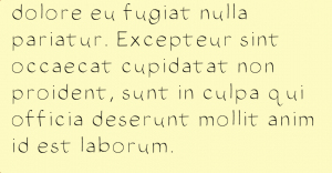
It’s actually quite a simple process to create a font, though you need quite a bit of patience and time. Using a tool called iFont, which is available for $5.99 on the iTunes store, those with iPads have the ability to make and use their own fonts. I splurged and purchased this app and then spent a painful three hours drawing out over 70 characters for my first font. “ChickenScratch” as I like to call it, is clearly a sans serif font (not by choice, but because I don’t have the ability to draw serifs) and is a good example of a decorative font (aka a font that’s hard to read because it’s basically my handwriting).

Though I created my font through an iPad app, most modern fonts are created through fancier digital methods and tools like Adobe Photoshop, ScanFont, and FontLab Studio can be helpful to speed up the process. New fonts, however, typically resemble old fonts. Inspiration for new fonts typically comes from the past, and therefore one may find that brand new fonts aren’t really that brand new.
Next time you go out, look for text on billboards, magazine covers or menus and try to pick out what period they may be from. I found a font from an easyjet advertisement that clearly draws inspiration from Greek lettering. All of the letters here are capitalized, and the A that’s missing its bar certainly reminds one of ancient Greek letters.

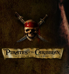
Another modern example of type that draws from the past is this advertisement for University of Exeter’s Pirates of Penzance. The font used is distinctly “pirate-y”, but why? If you look at the Pirates of the Caribbean movie posters, you’ll notice a similar font is used. This font is a Gothic-type font, and makes the viewer think of older, rougher days, where the concept of pirates is much more plausible than it may seem today. Both of these posters are helpful examples to show how old-style fonts are used in the modern world.

It’s amazing to realize that the text we see on a daily basis is there for a reason. Everything we look at has been designed with you, the viewer, in mind. We all know we’re looking at an Apple advertisement if Myriad Pro shows up. Well-chosen type has a purpose, and well-made type draws inspiration from original design whether that design is Carolingian, Roman, Calligraphic or Blackletter. Drawing connections from the past of typography is what makes today’s typography even better.

Want to learn more about type? Check out this article: “12 Great Blogs for Typography Inspiration”.
Or, learn more about the history of typography from Britannica Online.
