A rather interesting and often overlooked aspect of print design comes in the form of, well… forms. When you see this form  you immediately know what it represents, right? It represents the company Nike. The Nike “swoosh” is a symbol representing an idea (in this case, a brand). A large part of print design comes in the form of symbols and images that represent a larger idea or concept. These symbols range from marketing purposes all the way to simple decoration, but in the past, symbols were used largely for those who couldn’t read and even as a form of reading itself. These symbols, in the most ancient form, are hieroglyphs.
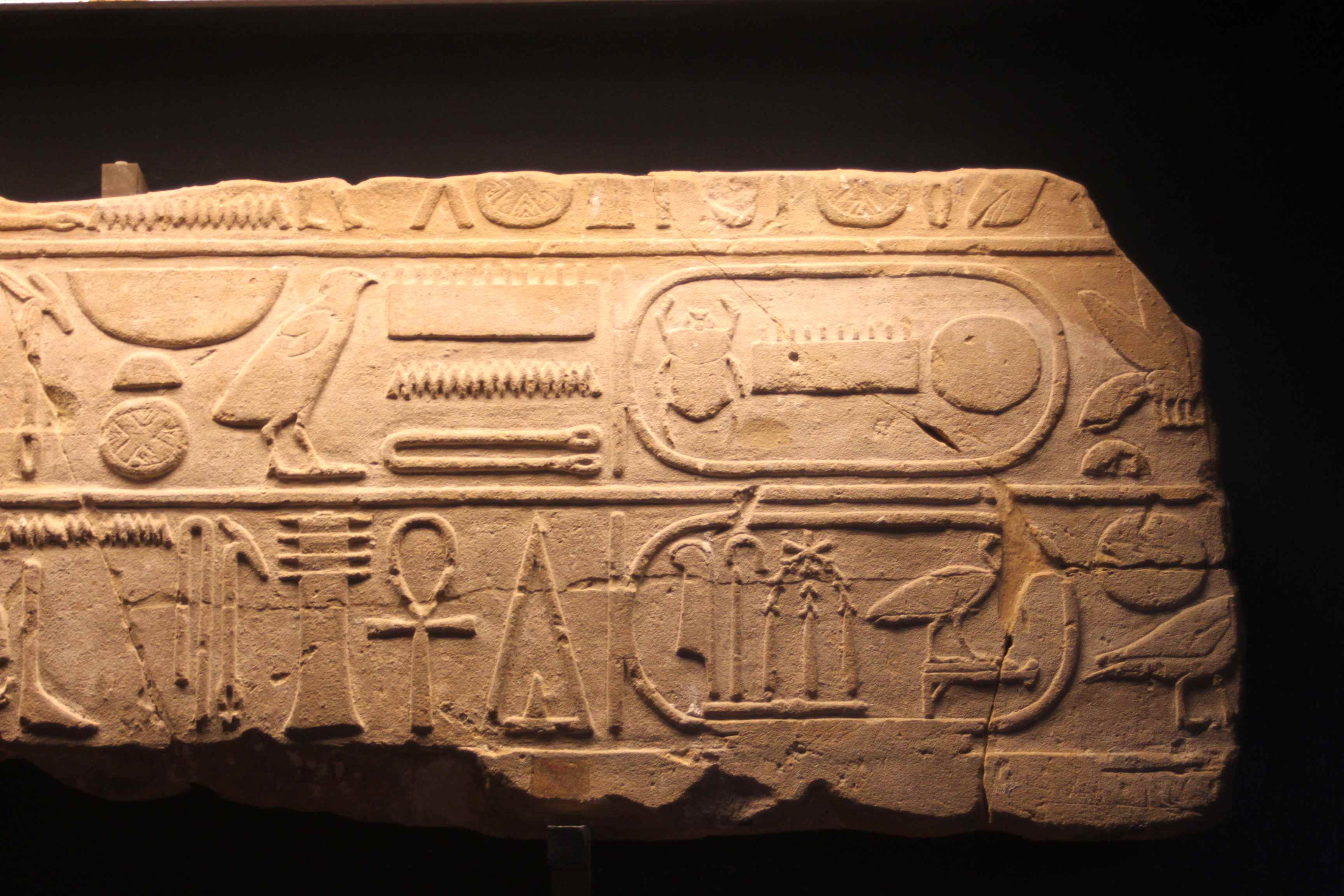
Hieroglyphs, originating in Egypt, were a form of writing involving images that created an alphabet of phonetic sounds. These symbols were strung together to form full concepts, but instead of our modern alphabet, they involved pictures.
A glyph, properly defined by Webster, is “an element of writing: an individual mark on a written medium that contributes to the meaning of what is written.” The glyphs I’m referring to, however, range far and wide and include many different things. These symbols, in the context of print design, represent a whole slew of possibilities. Punctuation, for example, can be seen as a glyph, because it contributes to the meaning of the writing itself. If there were a print advertisement for a funeral home, adding an exclamation point or two would contribute the wrong idea towards the ultimate advertisement (because seriously, no one should be that excited about funerals). But, an exclamation point wouldn’t be out of place on the cover of a comic book or even certain movie posters. Punctuation is a type of symbol that certainly contributes to the overall meaning of whatever is being written, and can therefore be considered a glyph.
An interesting example of the ever-changing nature of glyphs comes from the history of the ampersand, the form of punctuation that represents the conjunction word “and”. The ampersand is most commonly considered a logogram, because (as Encyclopedia Britannica says) it is a “written or pictorial symbol intended to represent a whole word.” Whether you call it a logogram or a form of punctuation, the ampersand is a symbol that has a long history. The ampersand began as a representation of the Latin word “et” which means “and”. The original versions of the ampersand literally look like the letters E and T put together, but as time went on, the ampersand became more stylized and morphed into the symbol we are familiar with today: &. This “evolution” of the ampersand, as you can see, depicts the various forms this symbol took on.

The way glyphs change is important to the overall concept of print design because these symbols are a huge part of print. The symbols we see every day that represent various companies and ideas are all glyphs, and the idea of utilizing these symbols to further one’s ideas is an age-old concept. Sometimes, it’s important to fully understand the story and message behind the glyph we are presenting, because though it may represent one thing today, it could have represented something entirely different four hundred years ago.
Not many people think about the connection between symbols we use today and symbols used in the past, but certain symbols that are important today were important many years ago, too. Vinča symbols, for example, are still utilized in some contexts today, although they originated in the 5th and 6th centuries. These glyphs come from a time when things were written through symbols, and a proper alphabet of phonetic sounds hadn’t come about. As you can see, they include some common symbols that we are familiar with, like the swastika. The swastika has a long history, much like the ampersand, but the swastika never changed much in looks. Instead, the swastika has had many different meanings through the years. It has origins in India and relates to the religions of Hinduism, Buddhism, and Jainism. The word Swastika comes from the Sanskrit “Svastika” which literally means “to be good”. This symbol was taken from its origins and used by other religions and societies to mean different things. The Nazis are one such group that utilized this swastika in a completely different way. Because the Nazi party adopted the swastika to represent themselves and the Aryan race in the 20th century, most people (Western people especially) associate this symbol with negative thoughts and feelings as opposed to its original meaning. It’s important to keep the meanings of symbols in mind when one utilizes them in print. Maybe a symbol means one thing to you, but means something completely different to your audience due to differences in culture.


It is clear that glyphs can change over time in two primary ways. The first, as we saw with the ampersand, is a physical change. The ampersand still represents the concept of joining two things together (“and”) as it did in its Latin origins. The other way in which glyphs can change over time is through meaning. The swastika never went through drastic physical changes, and yet the overarching meaning of the symbol changed dramatically as it got into Western culture and was adopted by the Nazis. It’s clearly important to include symbols and glyphs within print design to further the meaning behind the written words, but it is also very important to utilize the correct glyphs and to understand their origins as fully as possible.