
“Deconstructed Face,” Elisabeth Vehling
Some people believe that the hardest parts about publishing a magazine involves reading all of the submissions and choosing which ones you want to publish. Other people say that it’s copyediting the literary works and coming to an agreement between the staff and the authors. There are even those that would say that the biggest difficulty is developing a creative interior design that both assists the magazine in standing out and maintains the attention to the works. What I have discovered so far working on Scribendi is that the biggest challenge is designing the cover.
The cover is usually the first thing that one encounters when they pick up a Scribendi magazine. Therefore, the cover has to succeed in doing multiple things besides be unique and original. It has to draw attention to the magazine and develop an urge within someone to pick up the book. Not only does it have to grab a person’s attention, it has to keep their attention long enough for the person to open the cover to take a peek inside. Grabbing someone’s attention does not begin with the first page; the battle begins before the book is opened. A good cover also needs to give the reader hints to what may lay inside. If the cover uses visual art, that piece has to connect in some way to what lies inside. Is it part of a larger piece that is showcased somewhere in the book? Is the piece prize-winning? Or does the piece convey a theme consistent with the pieces inside the magazine? If the cover does not utilize visual art, the colors and text also have to connect to the interior design. This could be through the type of font used, the alignment of the text, or even the kind of graphic elements present. Lastly, a cover has to connect to past generations but at the same time be distinct from it as well.
In Scribendi, each staff member reveals their ideas of a cover design to the rest of the staff. Together we discuss each design and vote on which one we want as the cover design for the upcoming issue of the magazine. The design that is chosen goes through a few more edits and tweaks until everyone is satisfied with it. Everyone is going to have to wait to see what the 2018 edition of our magazine looks like when we have our official launch. In the meantime, take a look at the cover designs that did not make the cut. Each one was designed to reflect the overall experience of this edition in some way. It’s too bad that we can’t use them all.
Each color in this design are colors that aren’t typically seen in Scribendi cover designs. The addition of the flaps and the ends provide a definite place to define the magazine.

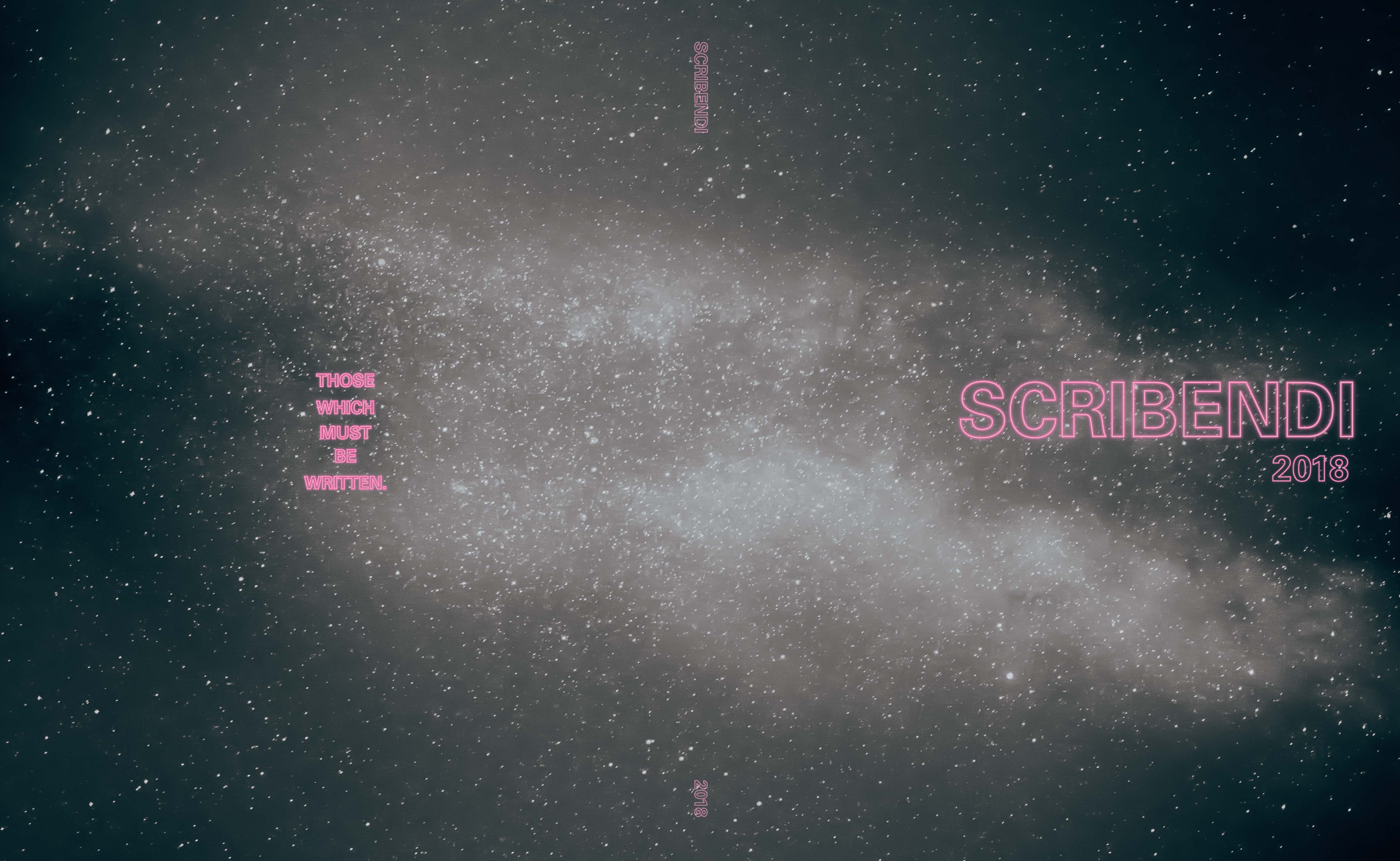
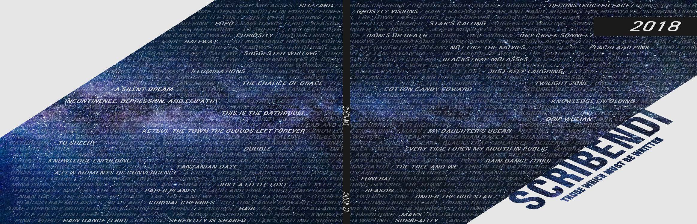
In this design, the text are intentionally larger than seen in previous editions. The background image is striking enough to grab one’s attention.
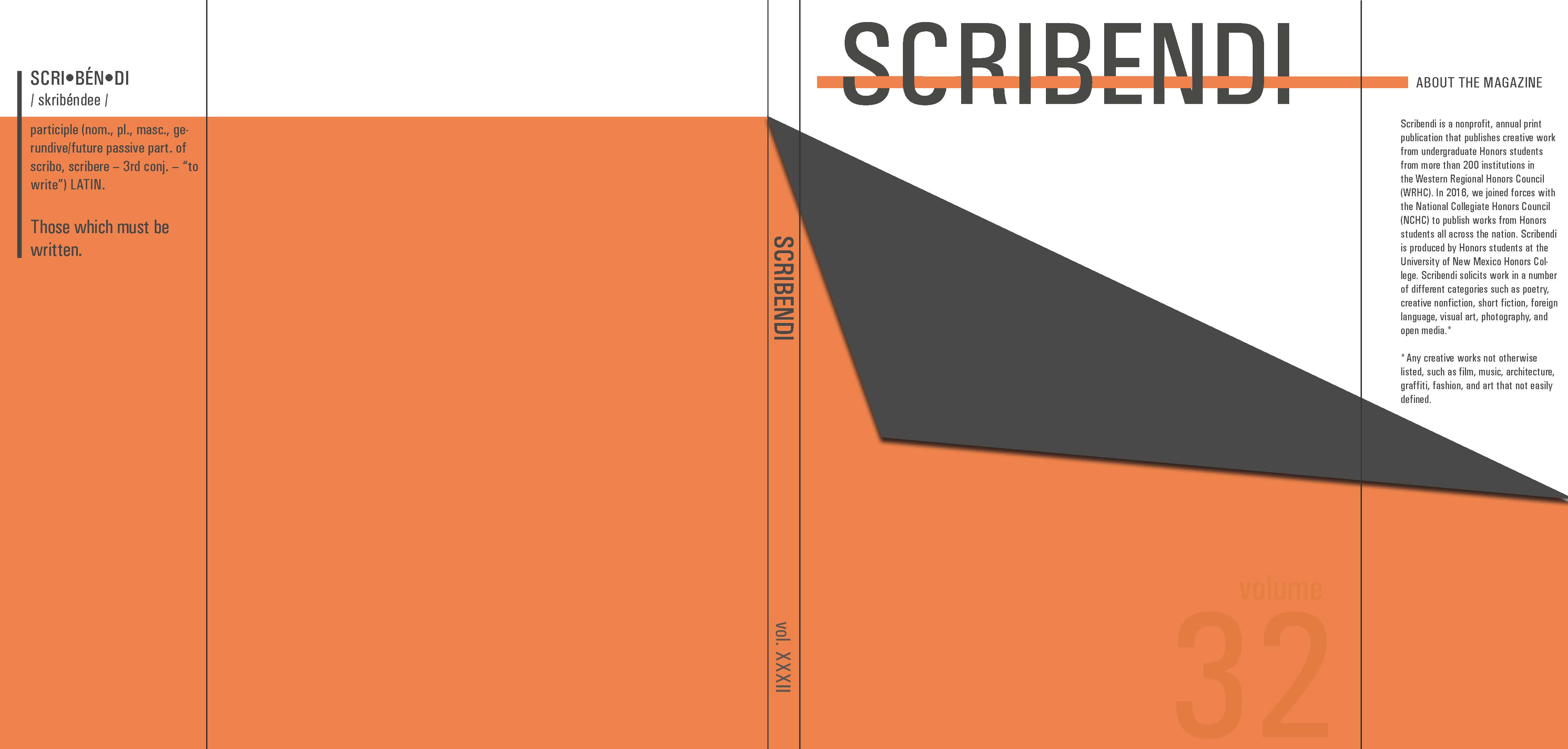
This design focused on a palette of warm colors whose purpose is to grab one’s attention and invite people to read our magazine.
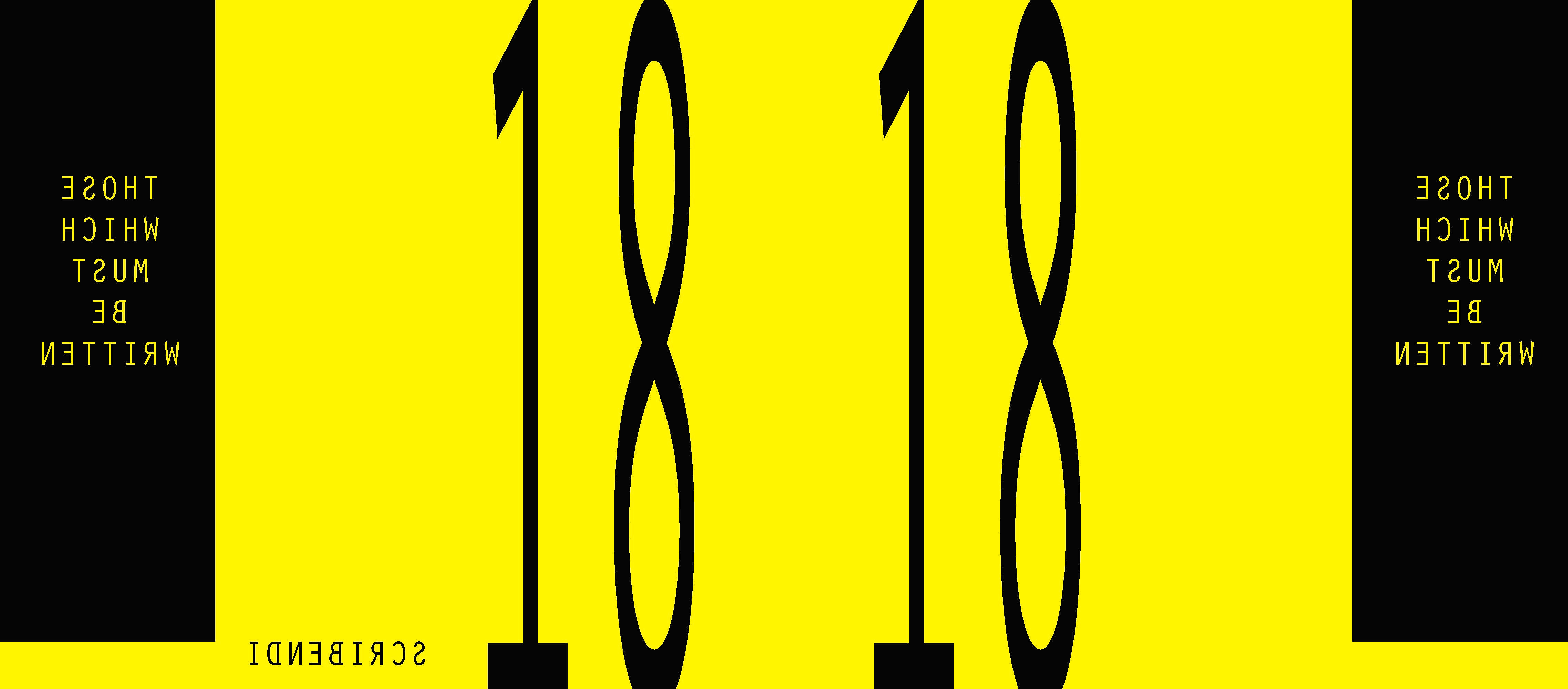
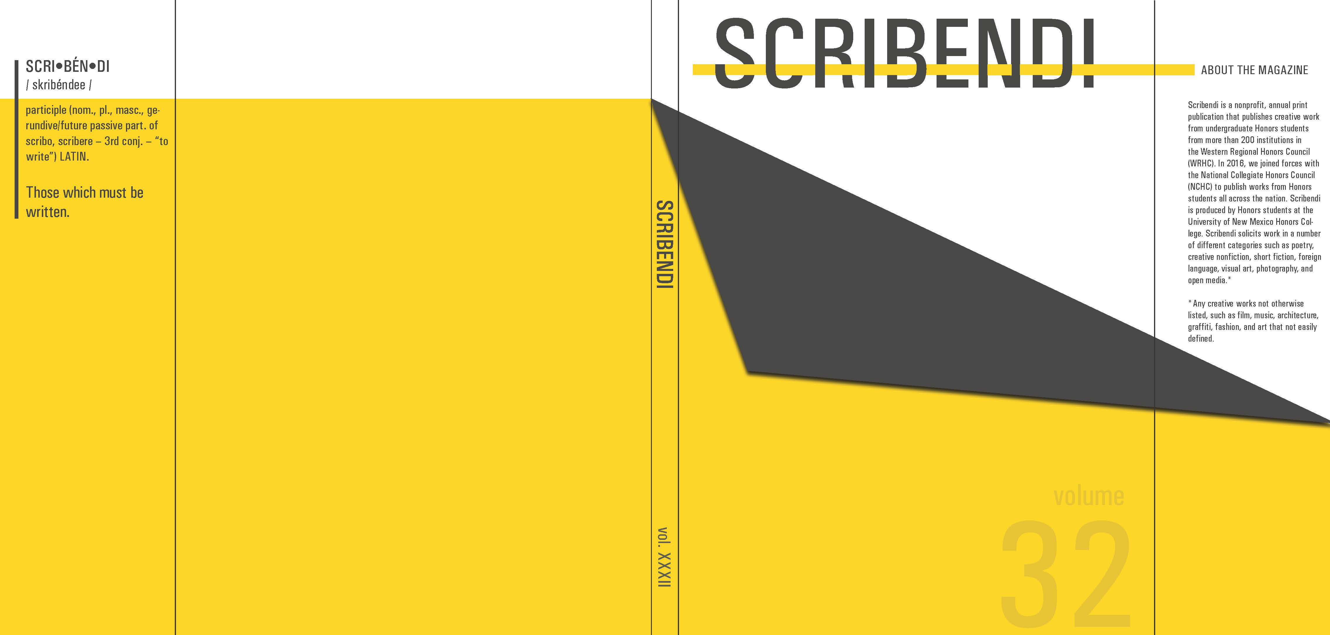
In this design, the golden yellow is used to separate itself from the crowd. This design includes flaps at each end.

Not all of the designs were meant to be bold and innovating. This is one such design which is extremely minimalistic in its nature.
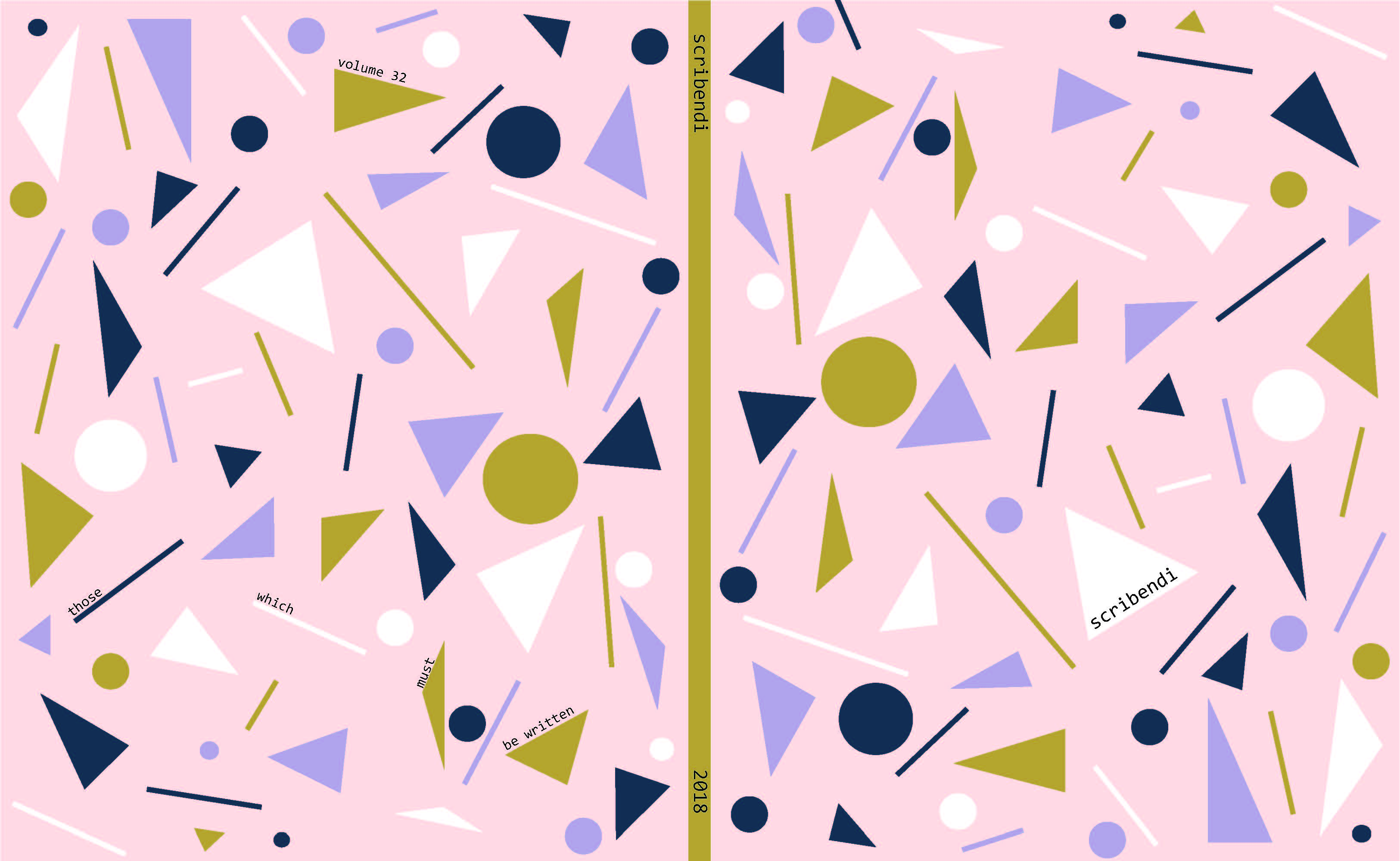
Who says that innovation is always best? This design brings back colors and tones from the past.
The focus of this design is on the background image rather than other graphic elements.
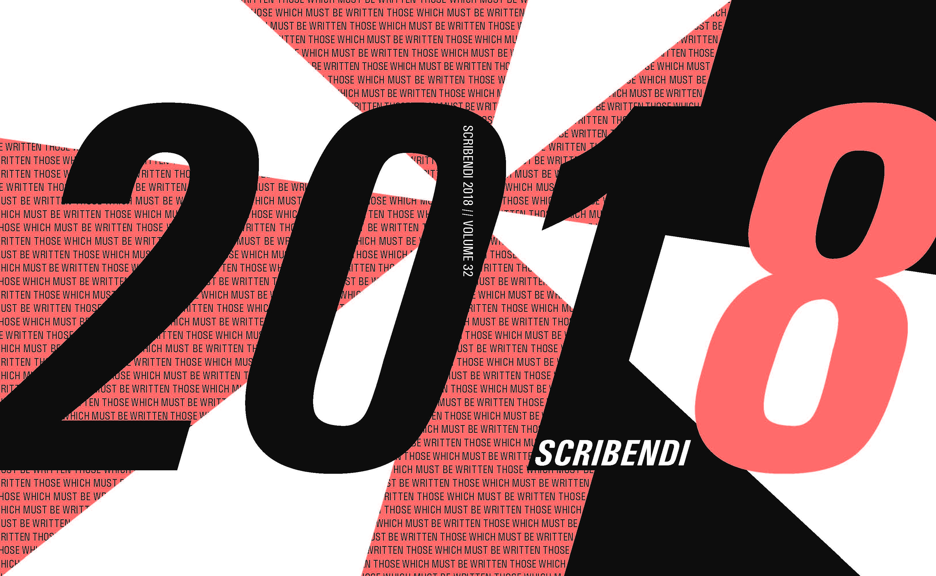
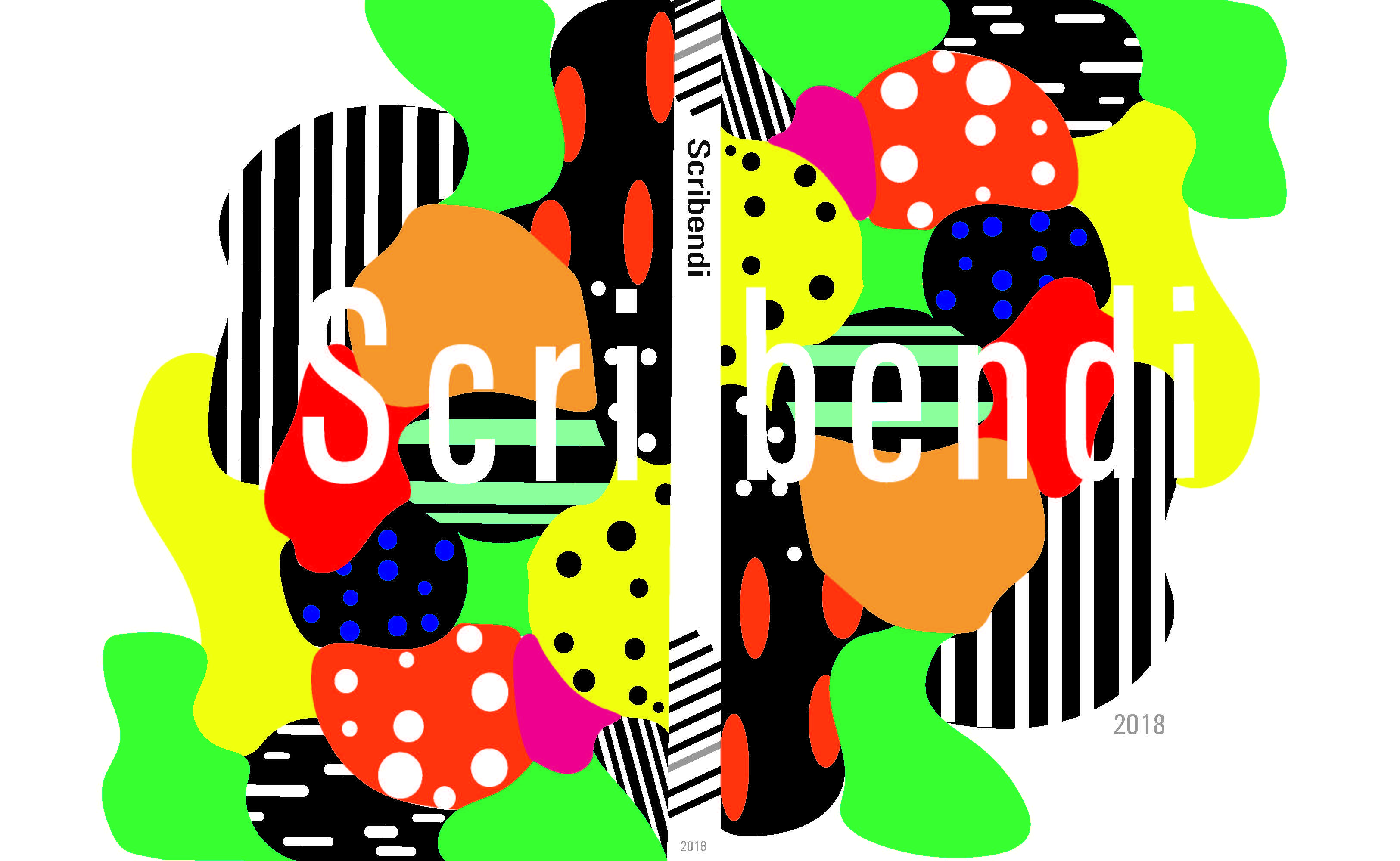
This is one design that makes a bold impact and grabs your attention from the very beginning.
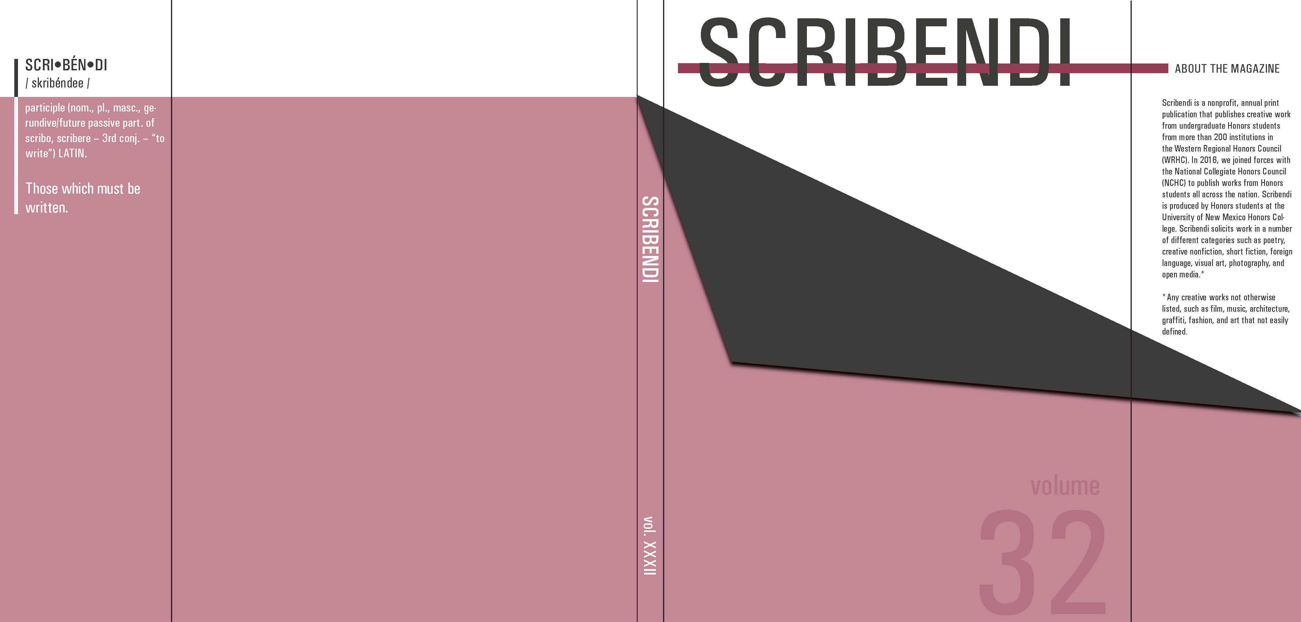
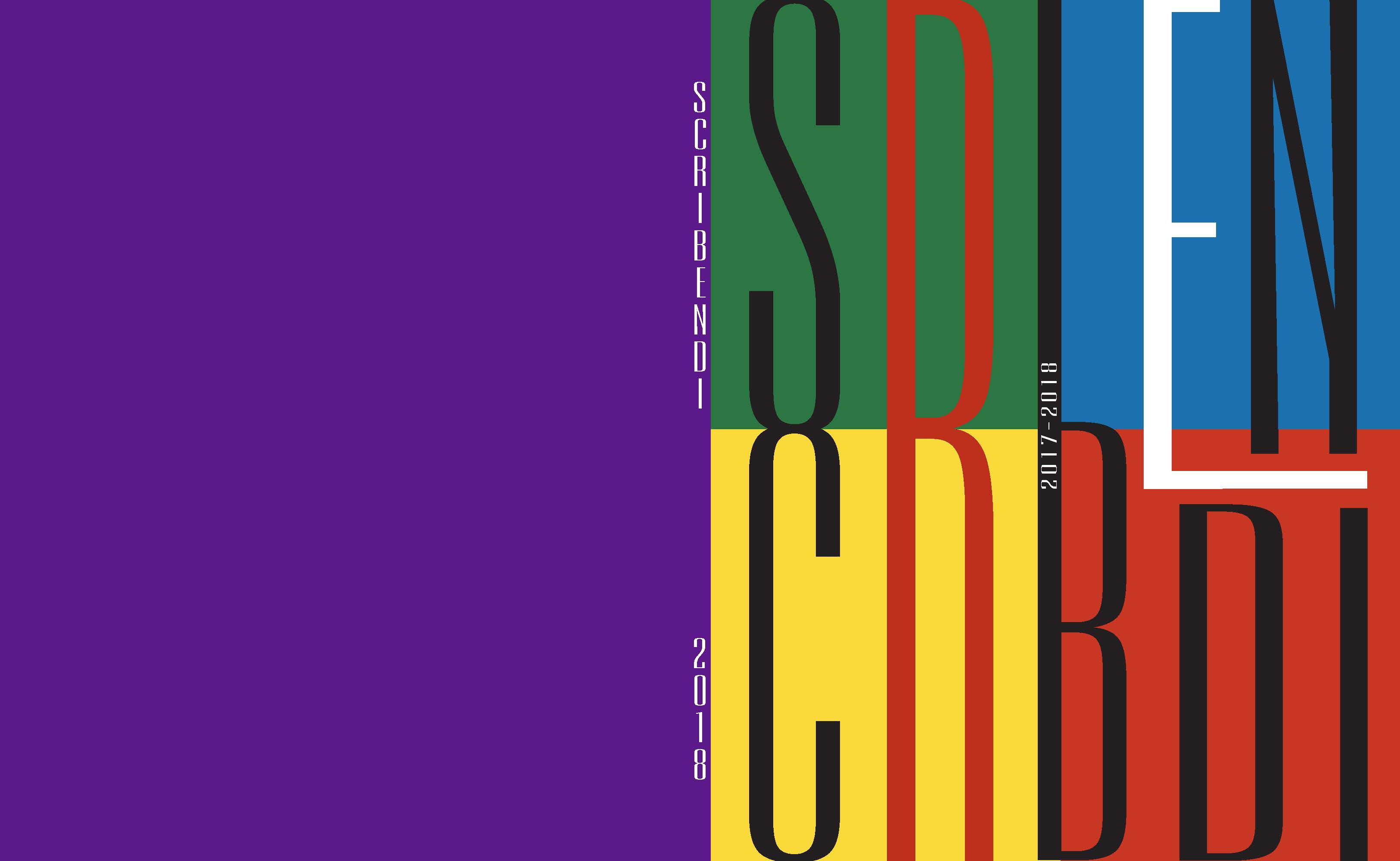
This is another design that introduces colors that are typically seen in Scribendi editions. This one is unique in its transition between warm and cool colors.
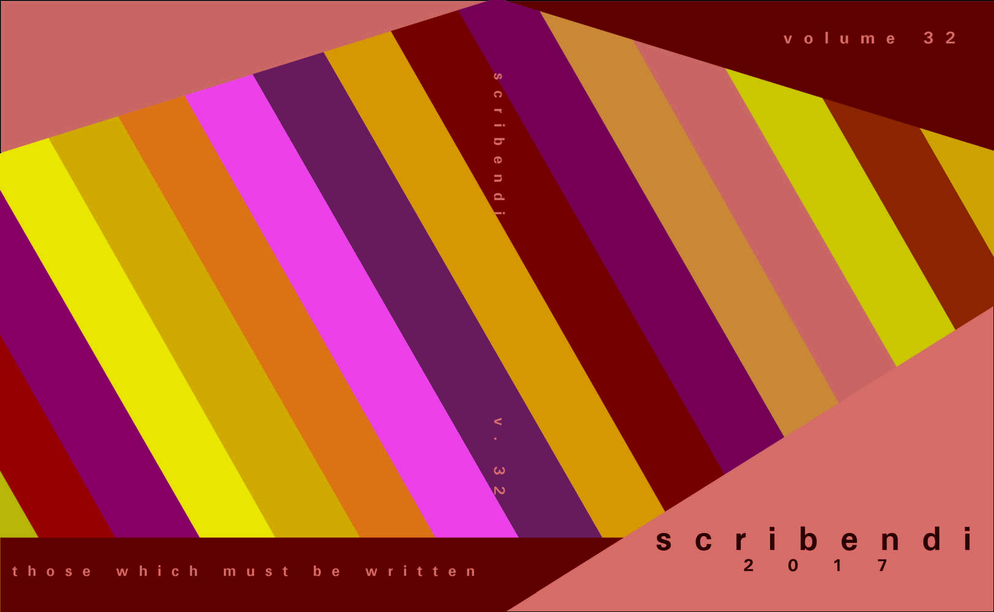
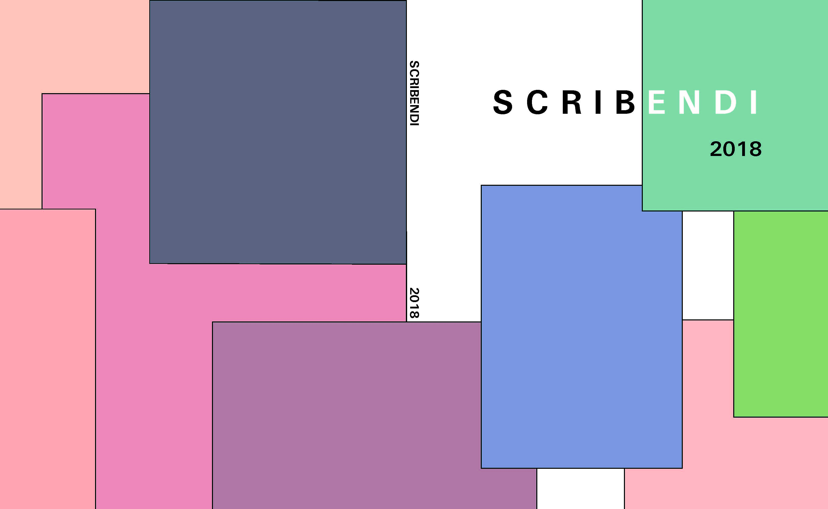
This design proves that there is nothing wrong with a cover that plays around with a bunch of different shapes.
From the variety of shapes, to the differences in textures, to the popping colors, there is a lot to admire within this design.
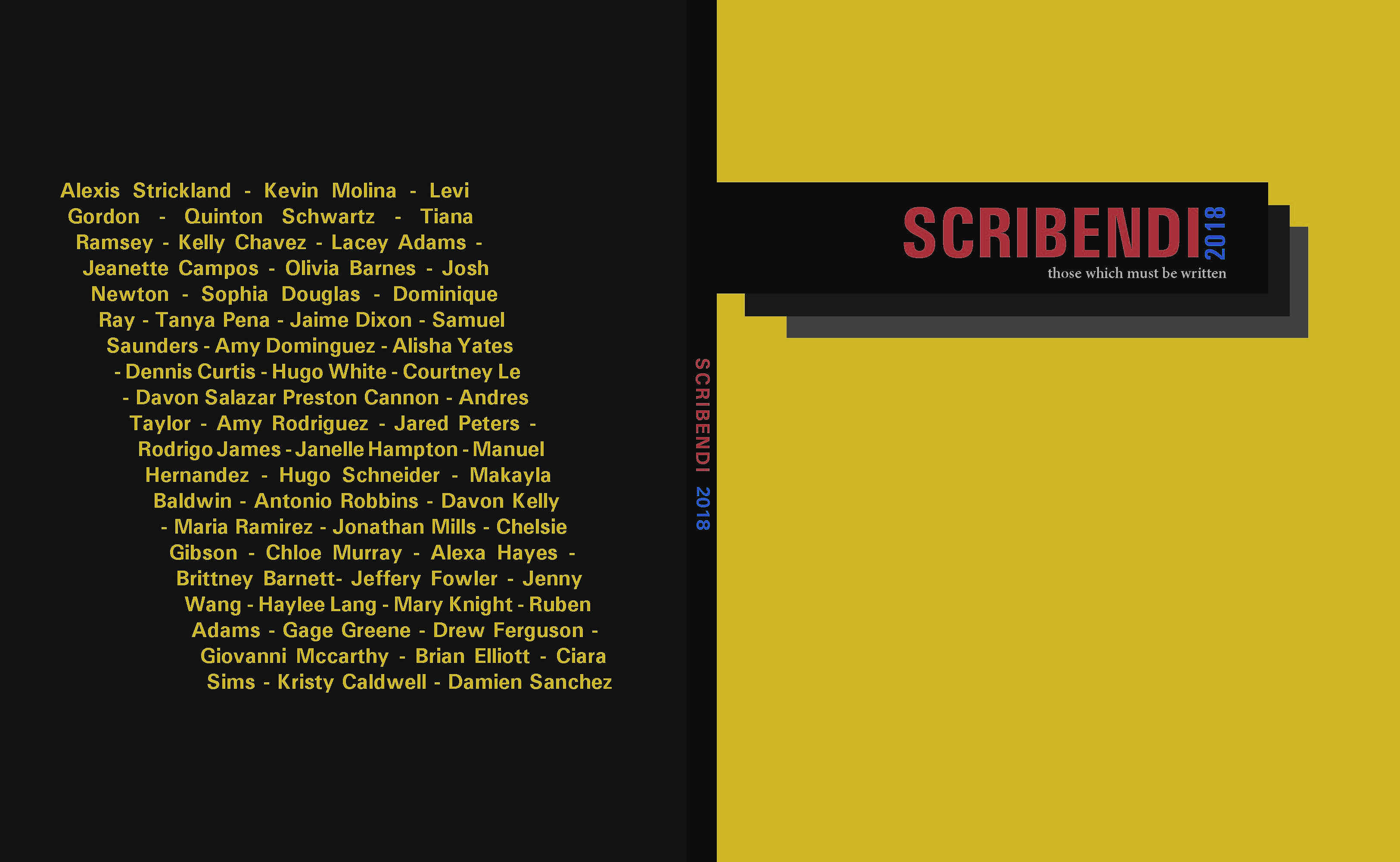
In this design, significance was placed on our contributors without which a Scribendi magazine cannot be made.
This design also placed importance on our contributors, focusing on the titles of their creative works that we are publishing.
Stay tuned for the unveiling of our cover and the rest of Scribendi 2018 at our opening receptions. The WRHC reception will be Saturday, April 14, 2018. For more information about this reception go to www.wrhc18.com. Our local reception will be Saturday, April 28, 2018. It will be held in the UNM Honors Forum (Ground floor of the Student Health Center) in Albuquerque, NM from 5:30 to 7:30 pm.